Abby
Lehman
Multidisciplinary Creative Marketing
Brand
Creative
Digital
Web
Marketing
Content
Brand Creative Digital Web Marketing Content
FEATURED CASE STUDYShoplook
BRAND IDENTITY ORGANIC CONTENT STRATEGY
-
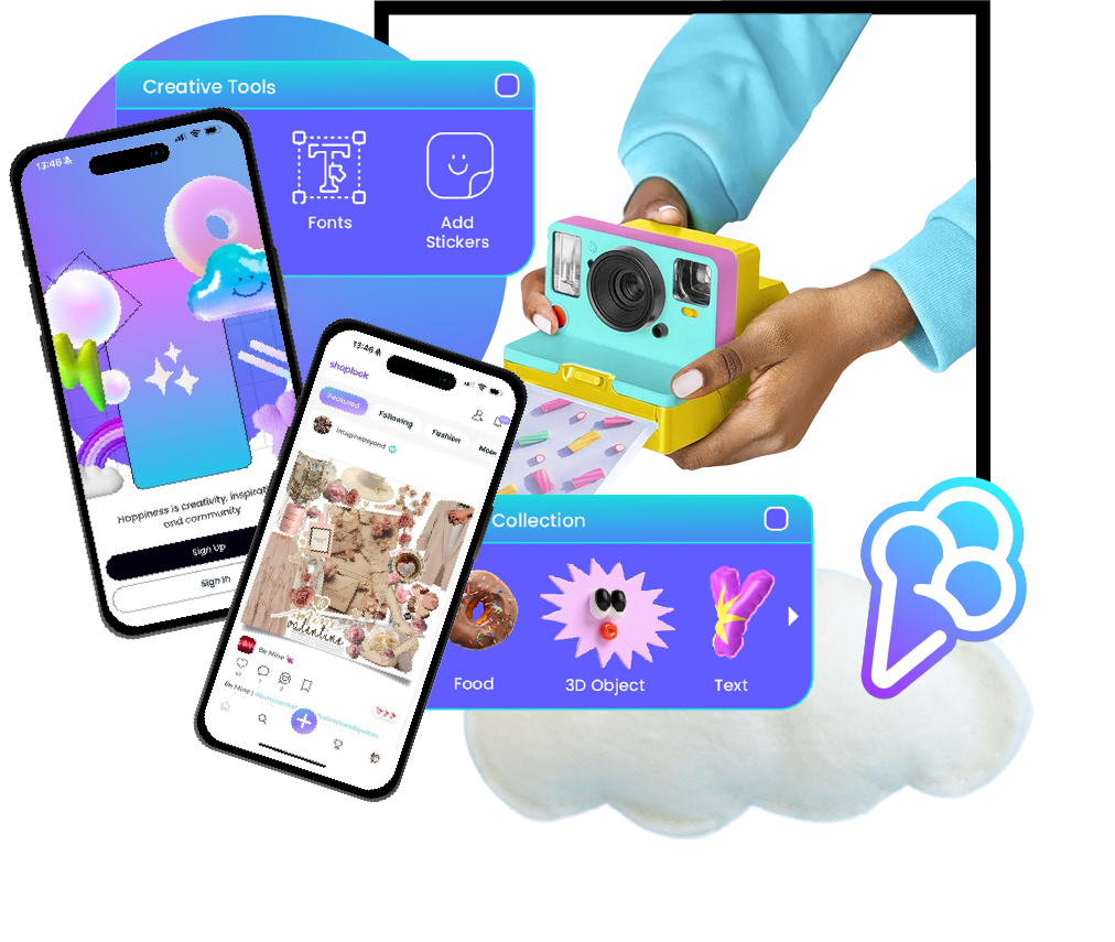
Shoplook launched in 2018 as a fashion discovery app, giving users a blank canvas to create their own looks and a community where they could share them.
After the platform surpassed one million users, the CEO saw an opportunity to evolve the brand identity to better reflect what Shoplook had become.
-
Shoplook lowered the barrier to creative tools, making visual storytelling more accessible to a younger, Gen Z audience.
This new generation of users pushed the platform beyond fashion, using artistic collages and mood boards for self-expression, curation, and inspiration.
To lay the foundation for future financial growth, Shoplook needed a brand identity that reflected this evolution.
-
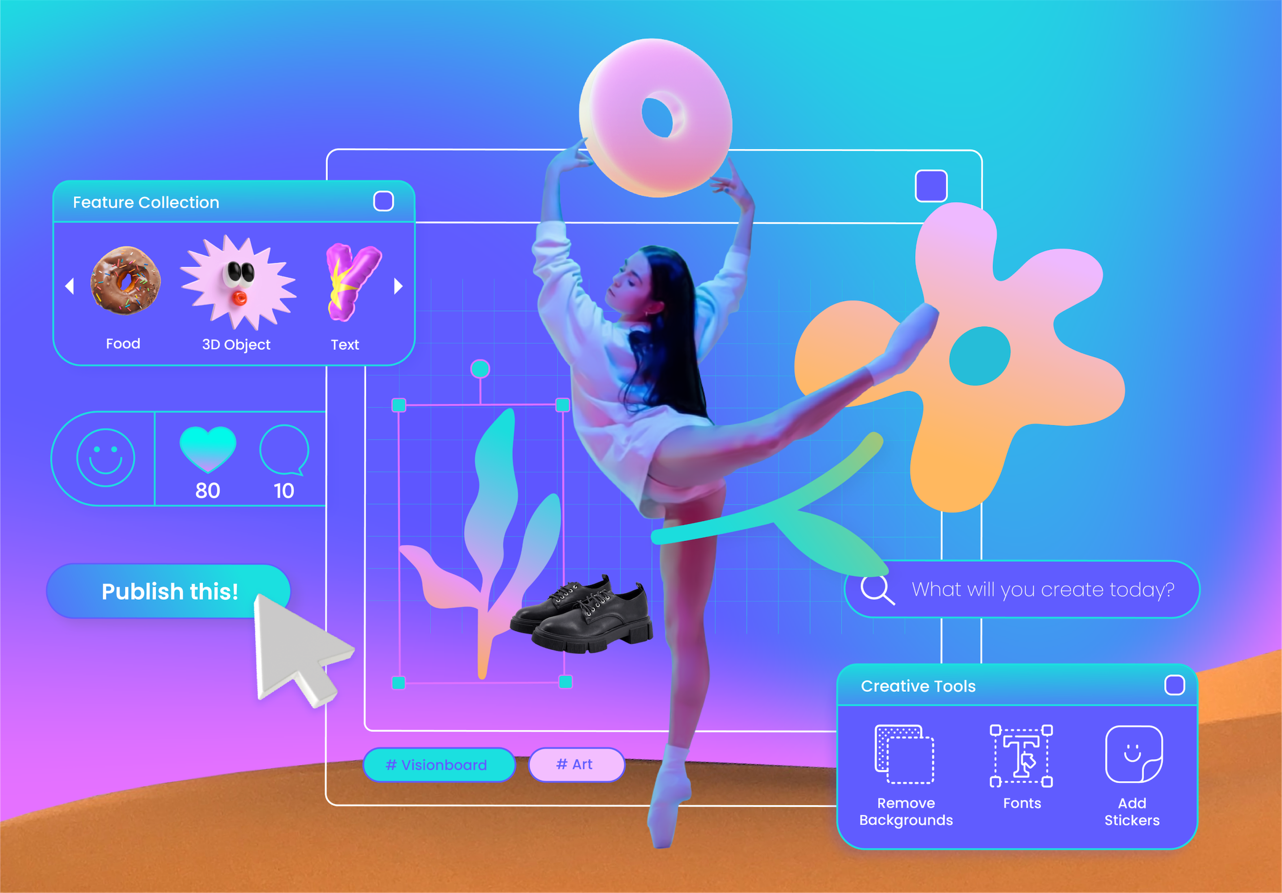
We modernized Shoplook’s logo and evolved its color palette, creating a distinct visual identity through saturated gradients, cutout collage imagery, retro digital interface elements, and a wireframe grid representing the blank canvas where every creation begins.
To support the launch, a regular blog series featuring user interviews would bring the refreshed brand to life while strengthening the Shoplook community.
FEATURED CASE STUDYENVI Ecosystem
BRAND IDENTITY CROSS-CHANNEL MARKETING CAMPAIGN
-
ENVI is a software product used by image analysts, GIS professionals, and scientists to extract timely, reliable, and accurate information from geospatial data.
Since its introduction over 20 years ago, it has become the industry standard for image processing and data analysis with a large user community and a recognizable brand identity.
-
ENVI’s brand identity had not been revisited or refreshed in 15 years and it was outdated.
ENVI needed a modernized brand identity that was part of a larger system of ENVI-based, Ecosystem products that were soon-to-be-launched.
-
We evolved the legacy ENVI logo into a flexible ecosystem identity, using the familiar icon as the primary mark and distinct, vibrant color palettes to differentiate each product. Simplified product lockups and updated Roboto typography created a cohesive system that could work across individual products or the full portfolio.



More Case Studies
Additional featured project stories from concept to execution.
-
Event Visual Identity
Video Production
Physical Space Graphics
Content Campaigns
-
Digital Experiences
Marketing Program Management
Creative Content
Visual Identity
Project Galleries
Collections of individual work by discipline.
-
Sharepoint Sites
Web Layout
CMS
-
Layout
Template
Infographic
-
-
Script writing
Interviews
Production/Editing
Post-Production
Publishing
SKILLSBRAND
Identity
Marketing
Frameworks
Governance
Digital Asset Management (DAM)
CREATIVE
Graphic Design
Digital Campaign Assets
Print Collateral
Video
Presentations
Physical Spaces
Template Creation
DIGITAL
CMS
Websites
Landing Pages
Live Events
SharePoint Intranet Sites
Web Content Strategy
MARKETING
Organic Content Strategy
Technical Marketing
Operations
Technology
Thought Leadership Educational Campaigns
Enablement