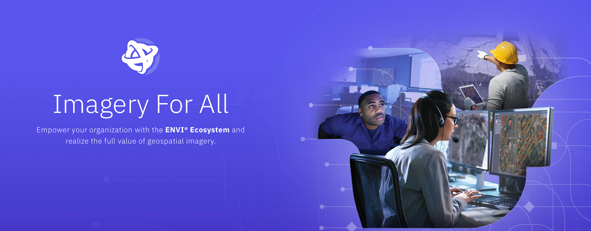
ENVI Ecosystem
Expanding a legacy product into an ecosystem.
CASE STUDYMy role:
Creative Lead
Logo Modernization
We gave ENVI a cleaner, more flexible identity that could applied to multiple products within its new software ecosystem.

Before

After
Evolving the legacy mark:
Reinterpretation of its recognizable globe
Simplified geometry
Removal of dimensional effects
Brightening the color palette
Shifted to icon as primary mark, keeping full wordmark in situations that required context.
Unique Color Palettes
ENVI was now part of a larger software ecosystem, and the updated logo was flexible enough to represent multiple products.
ENVI Ecosystem
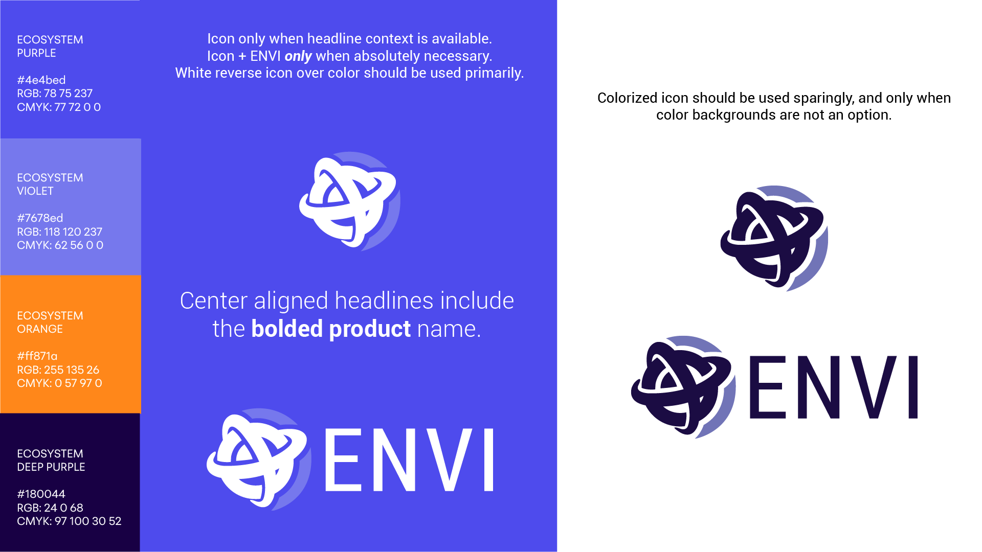
Product: ENVI Connect
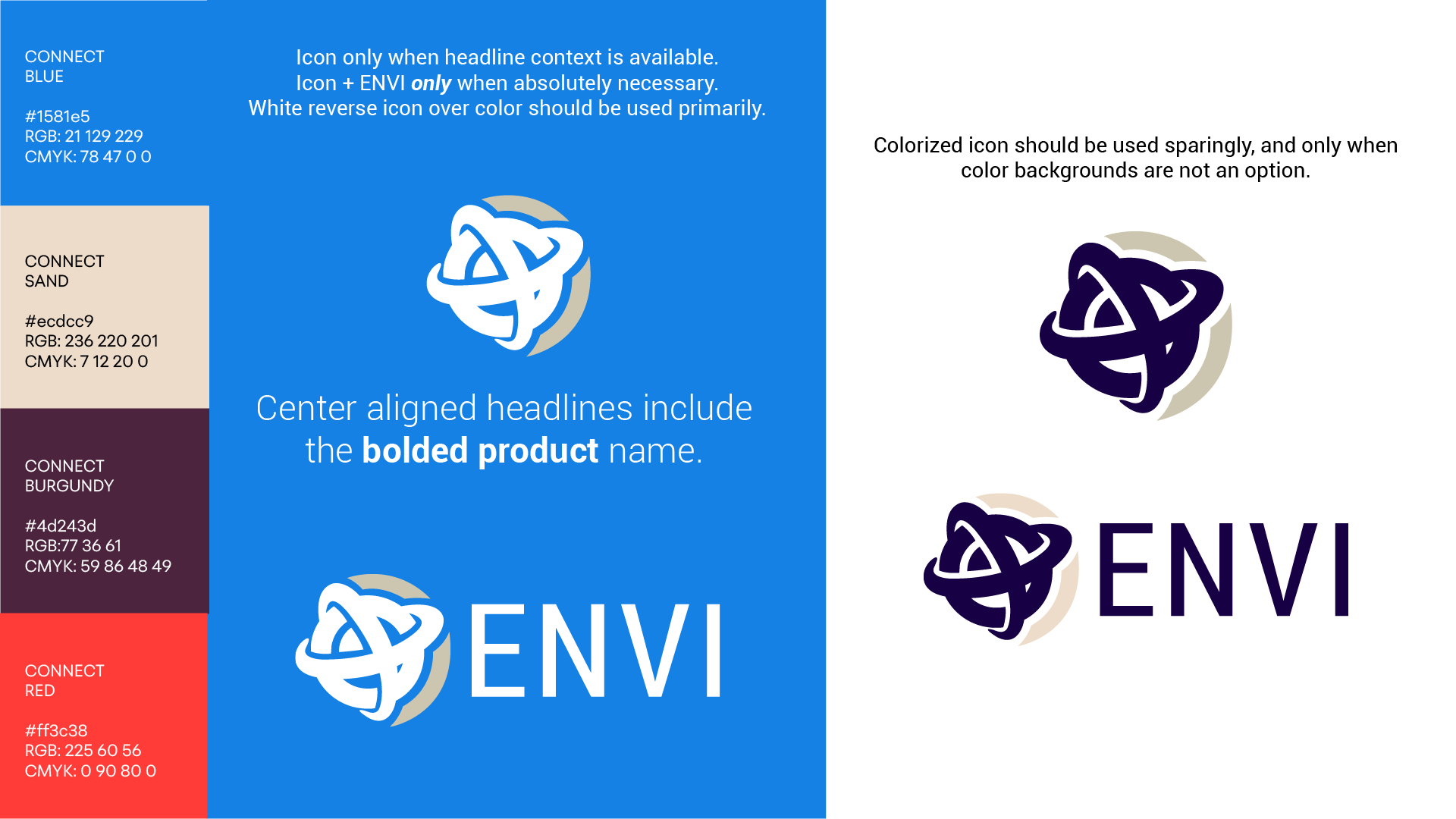
Product: ENVI Insight
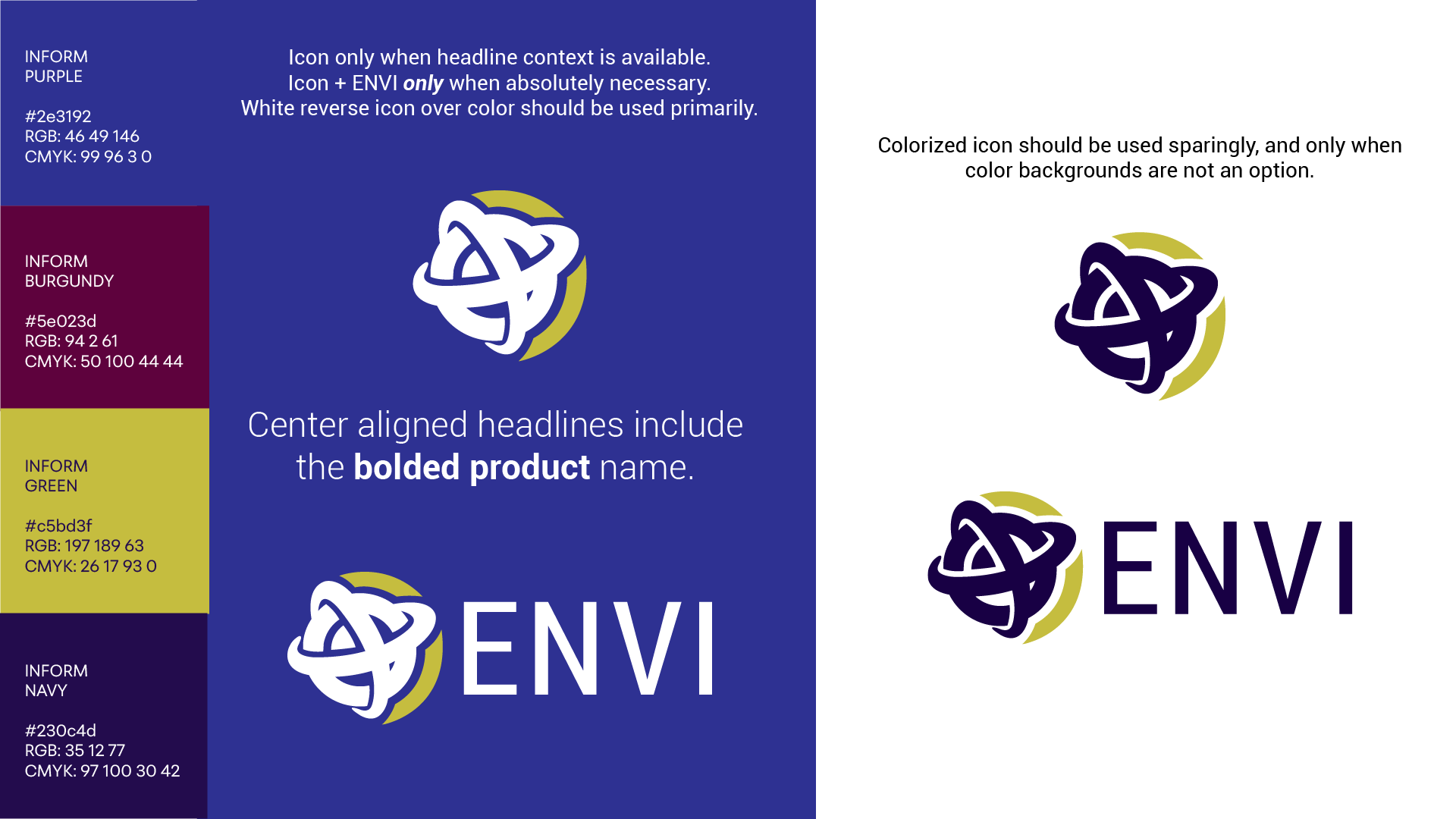
Product: ENVI
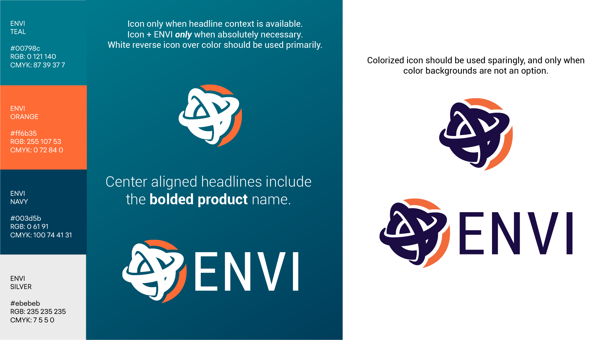
Using color to differentiate:
Unique color palettes differentiated the ecosystem as a whole from its individual products.
Reverse white logo over color became standard for use
Photography and Design Elements

We shifted from technology-focused imagery to persona-led photography that put users and their work at the center of the brand.
Layered cutouts, soft transparency gradients, and simple geometric line work added depth while connecting the imagery back to data and geospatial technology.


Distinctive imagery:
User-focused photography
Sharp subject cutouts
Background transparency gradients
Simple geometric thin stroke vectors
Website and Video Content
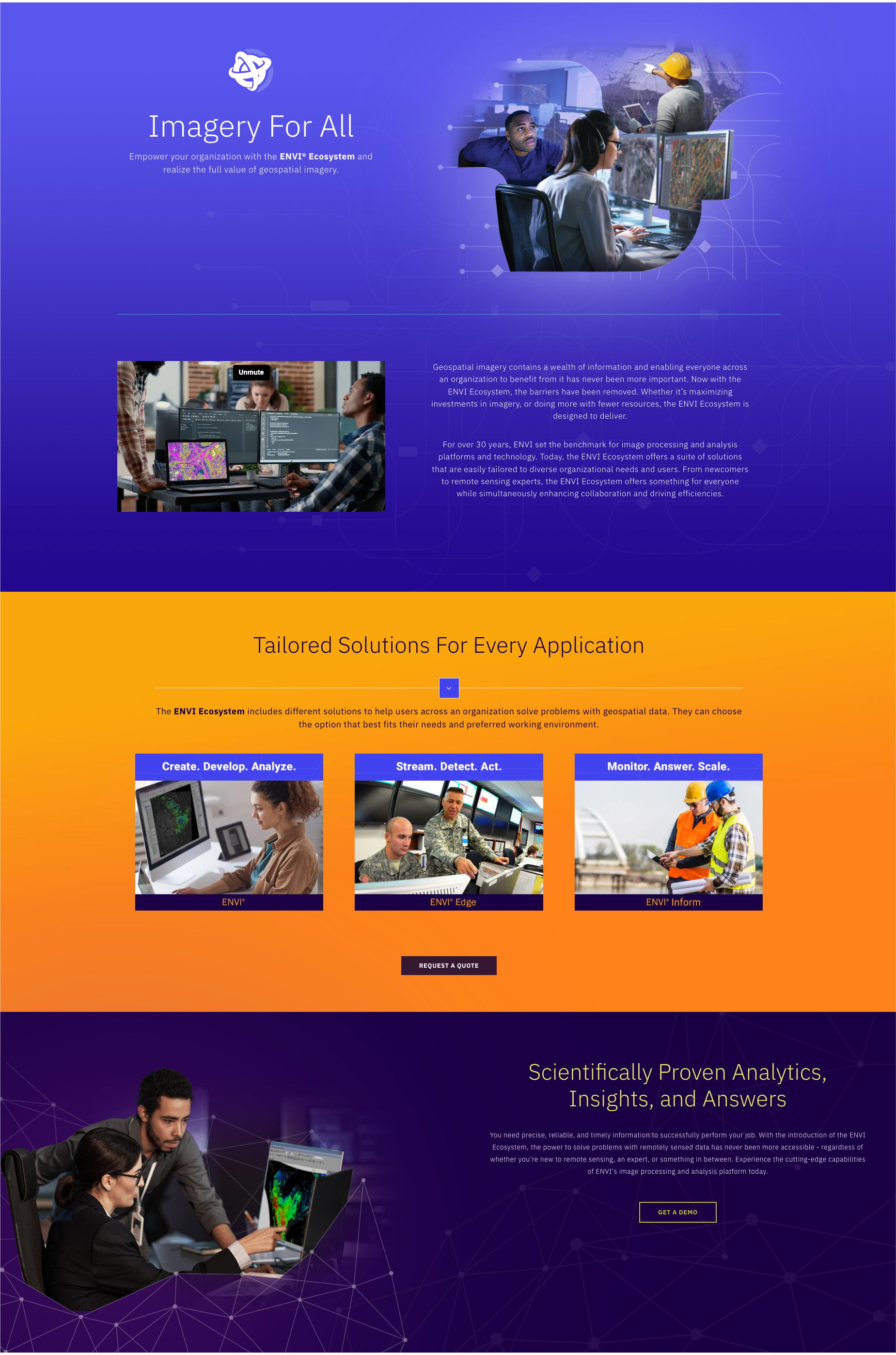
Brand vision comes full circle when combining imagery, color palettes, and simple messaging across product webpages.
Overview video created and featured prominently below the hero banner.
Video
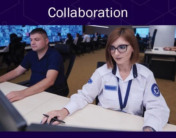
Use Cases



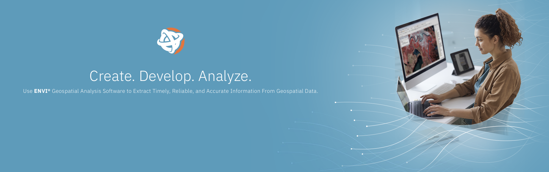
Product Hero Banners

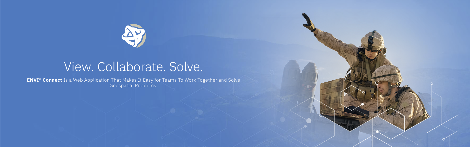
WEB SHOWCASE:
Brand imagery + color palettes
Colorful section blocks
User-focused, simple messaging
Prominent CTA’s
Video content
Clear use cases
Marketing
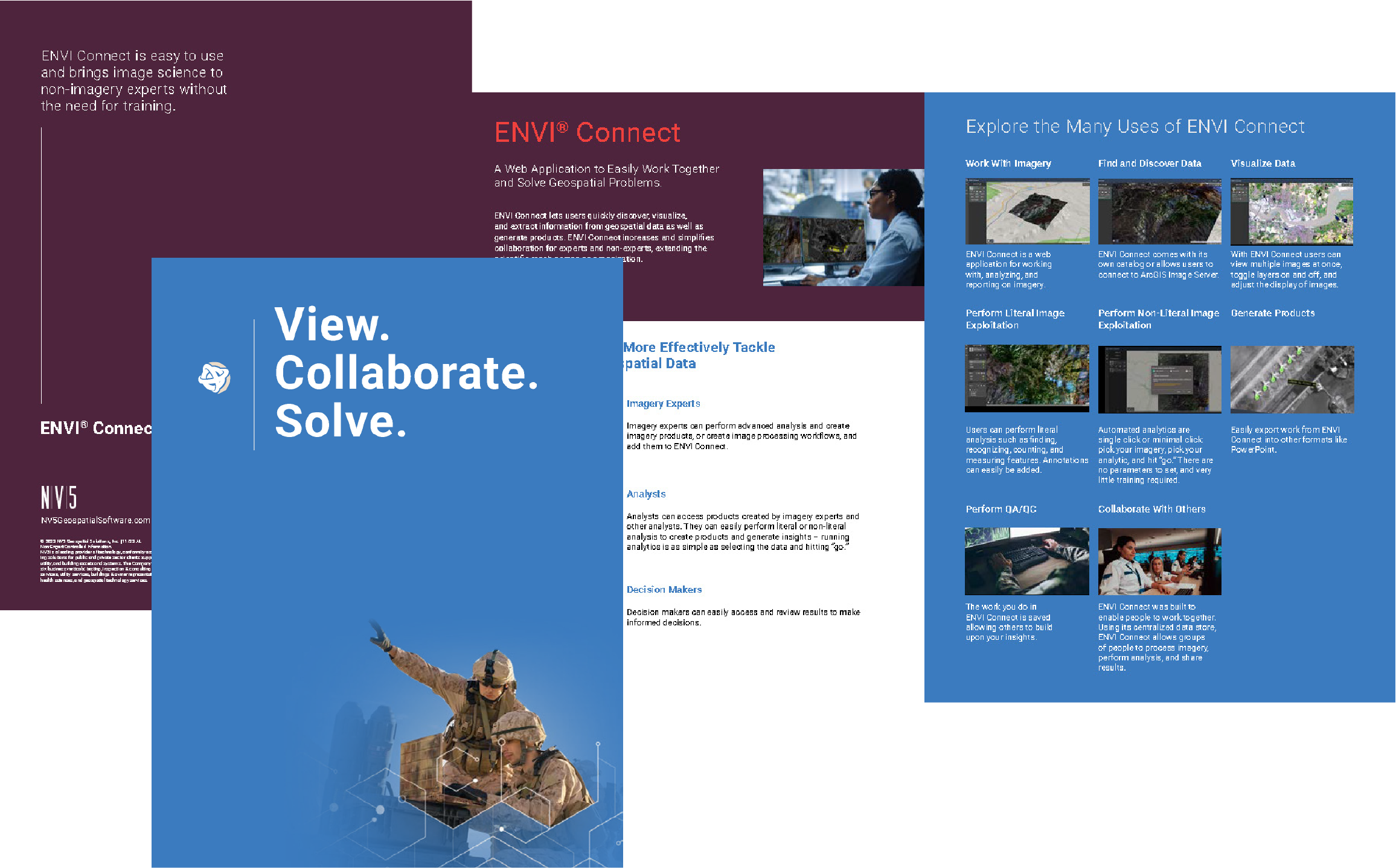
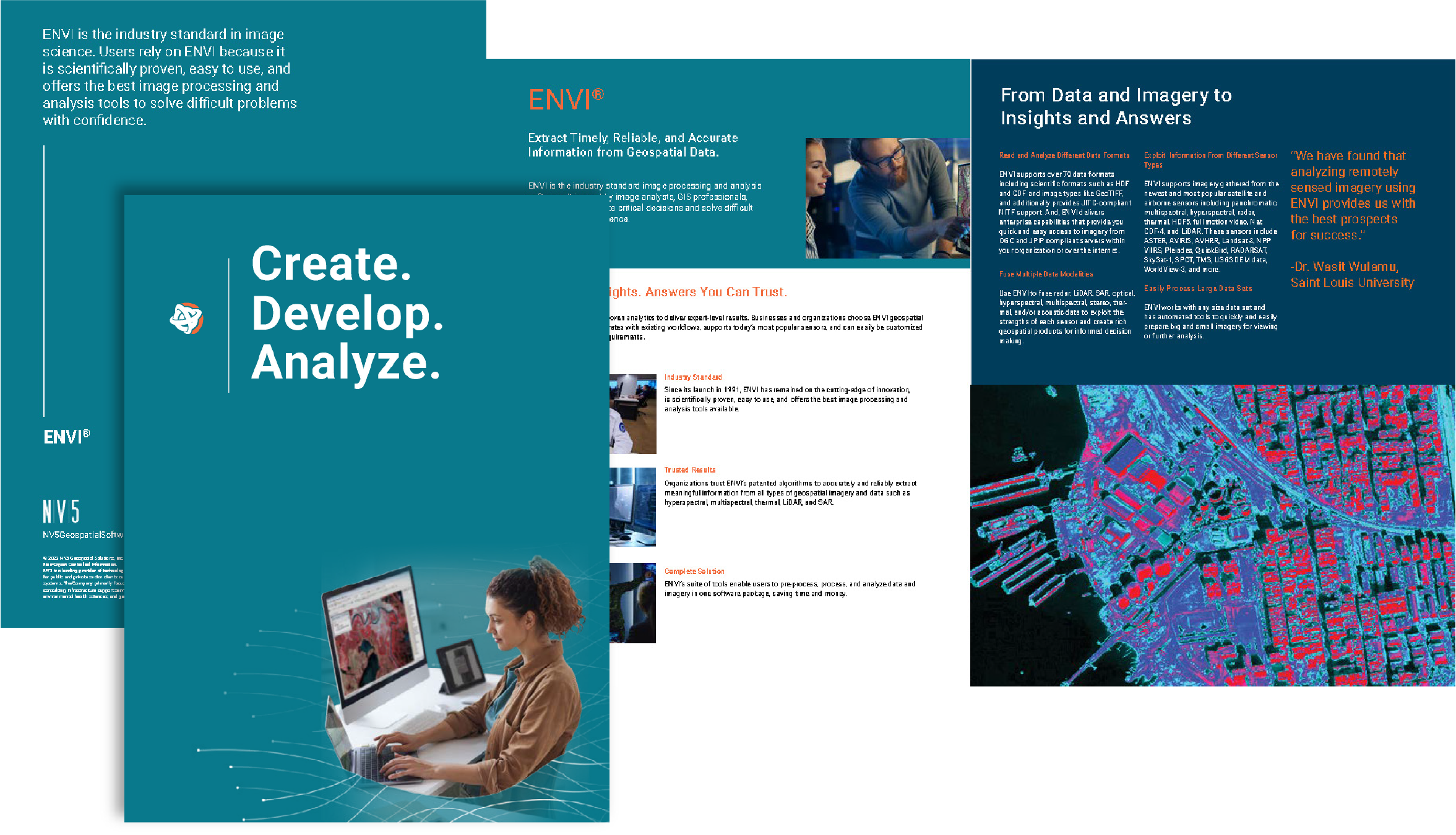
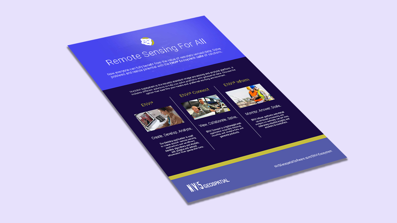
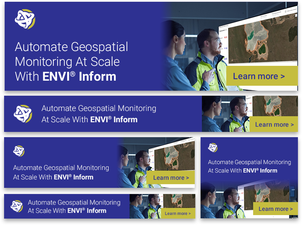
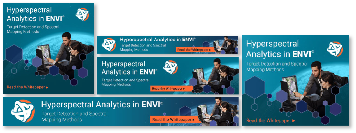
Multimedia marketing campaigns to launch the new brand across both print and digital spaces.
Brochures
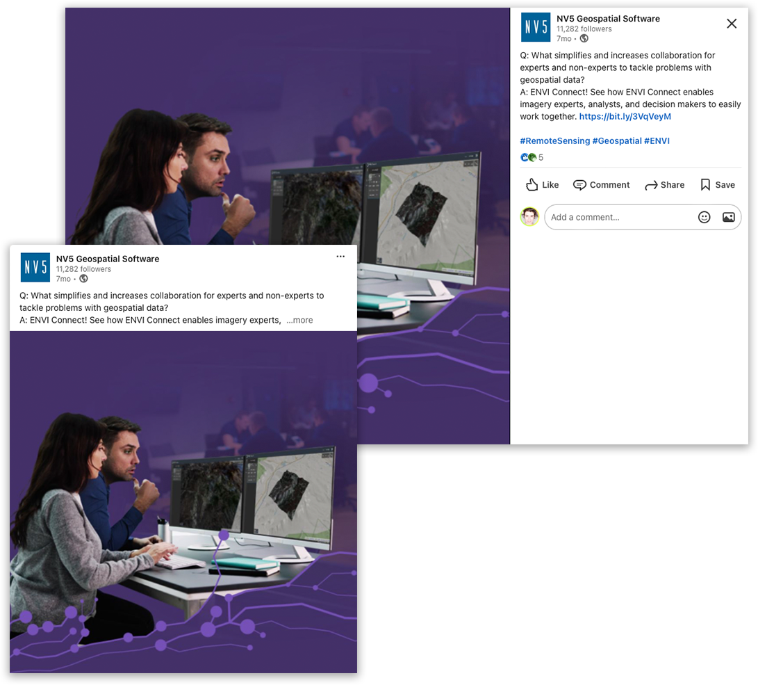
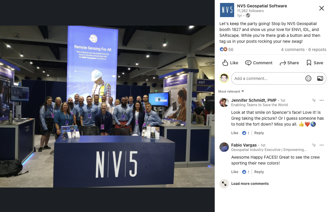
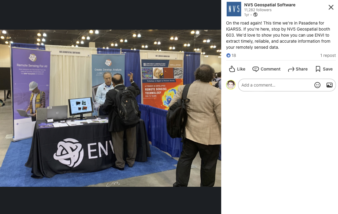
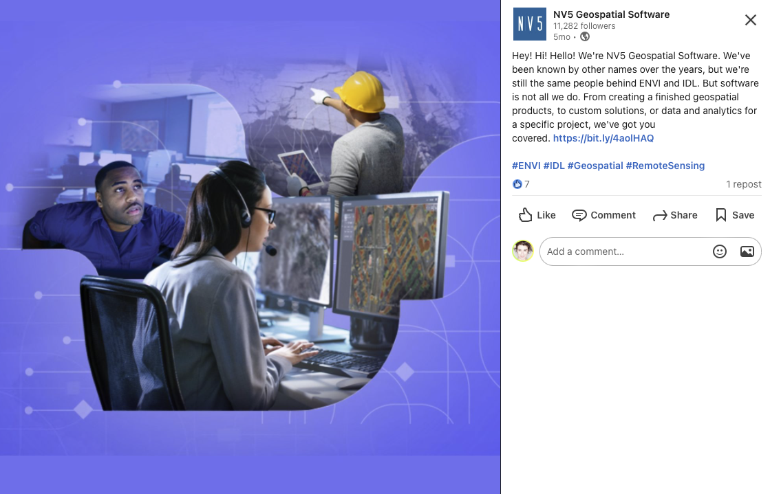
Social
Banner Ads
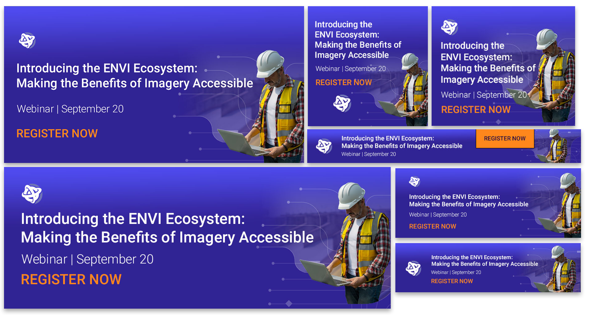

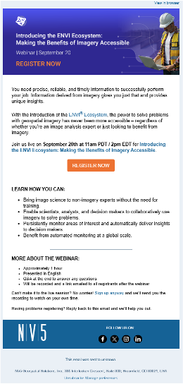
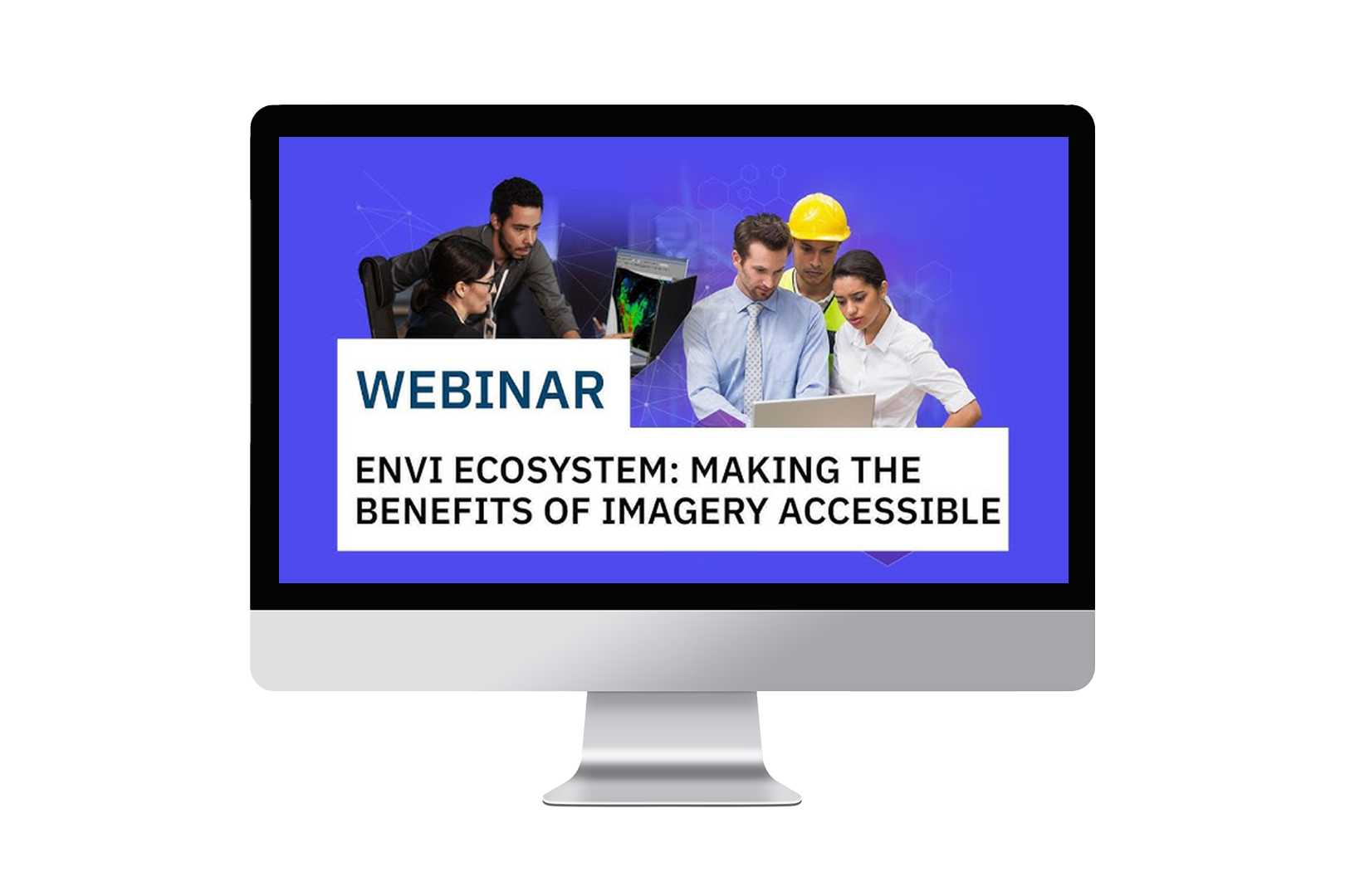
Webinar
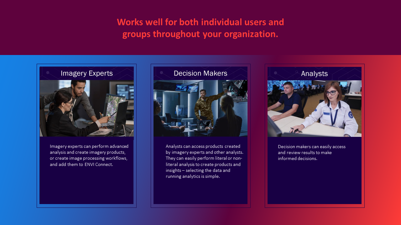
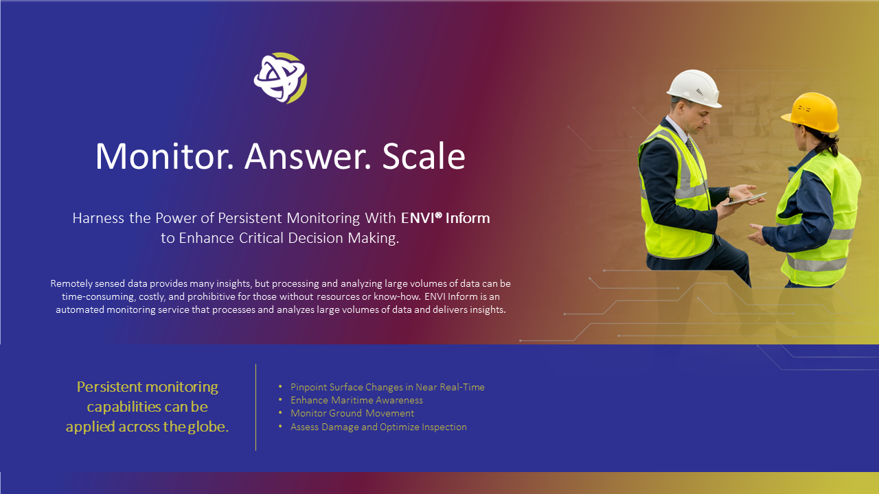
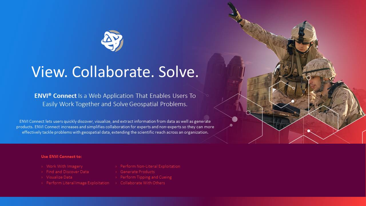
Slide Decks
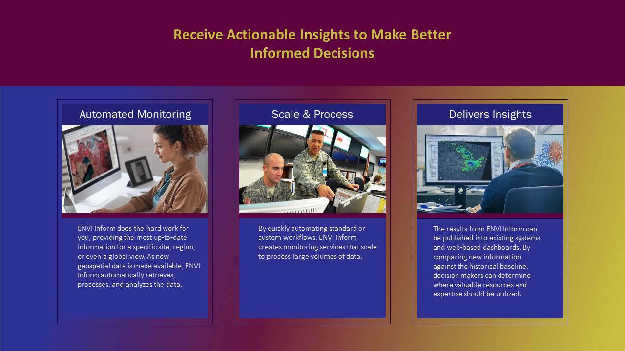
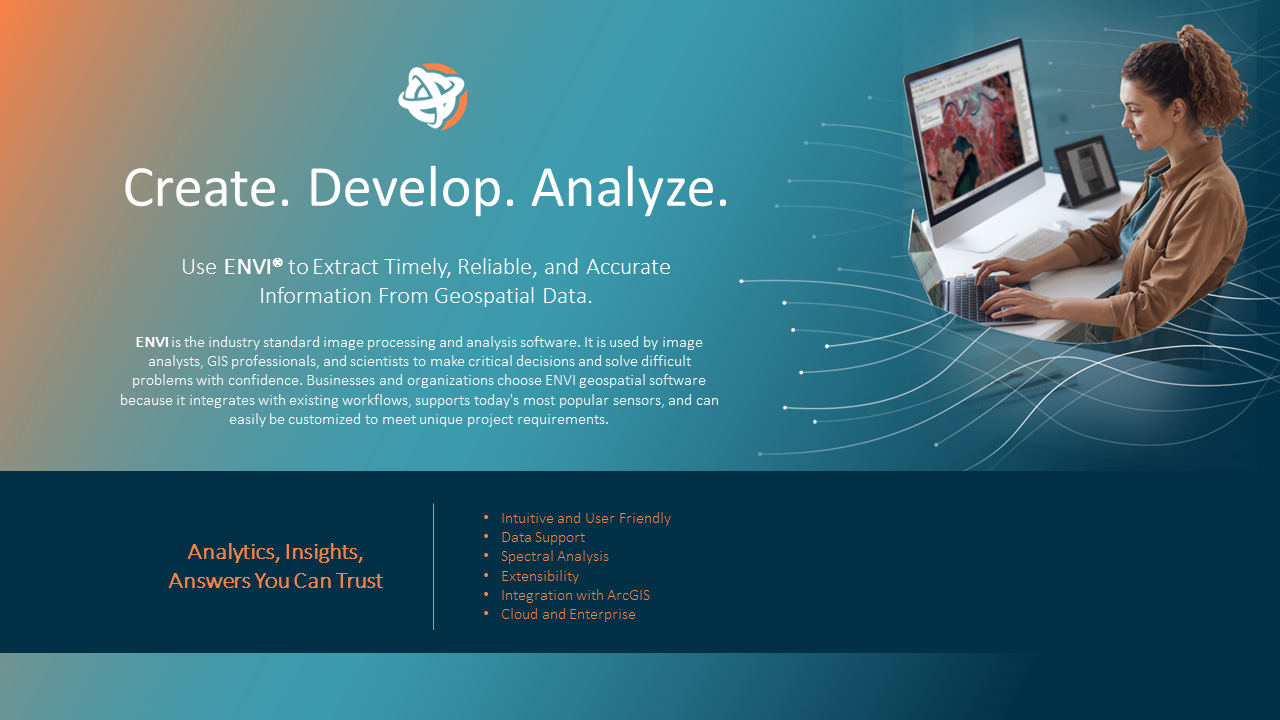
MARKETING THE BRAND:
Banner Ads
Handouts
Brochures
Webinars
Sales Enablement
Presentations
Social Media
Booth Graphics