CASE STUDYShoplook
Evolving a fashion app into a creative community.
My role:
Creative Lead
Creative Concept Development
My Role:
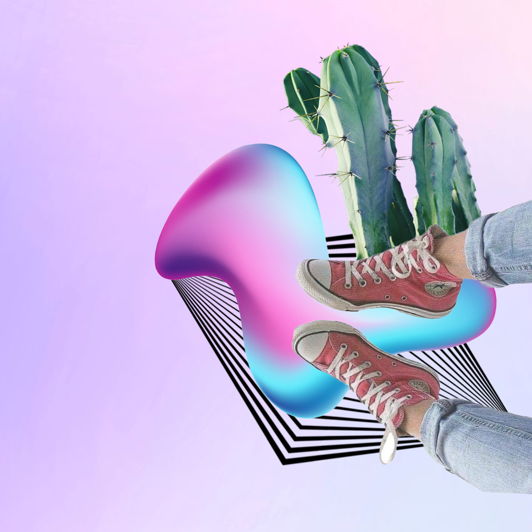
Moodboards, mockups, and presentation artwork to refine and develop the core visual framework.
1
Creation of moodboards filled with trends, inspiration, and ideas that would shape the app’s aesthetic and key visual elements.
2
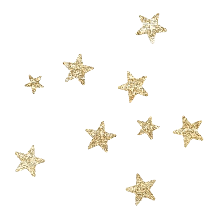
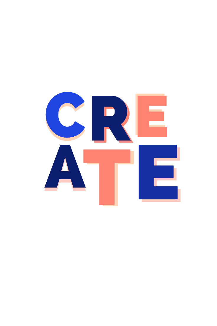
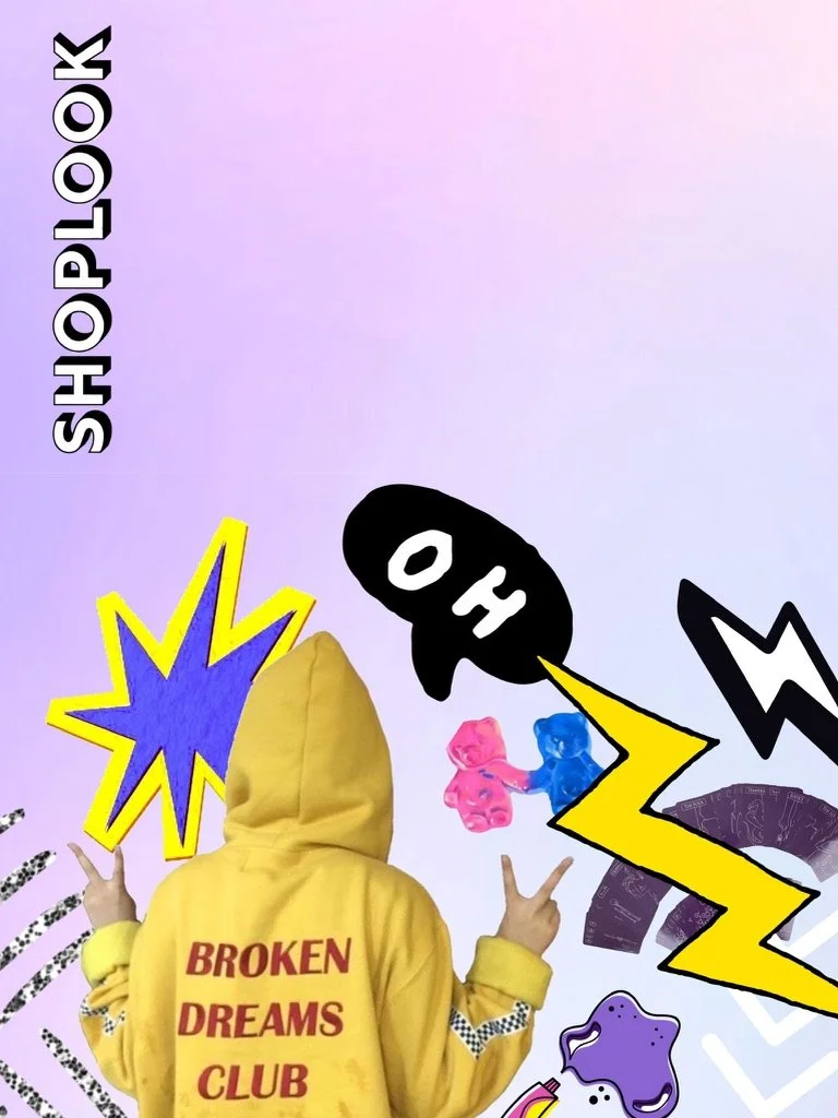
Mockup artwork to visually encapsulate these themes and establish a strong foundational starting point before engaging with a third-party agency.

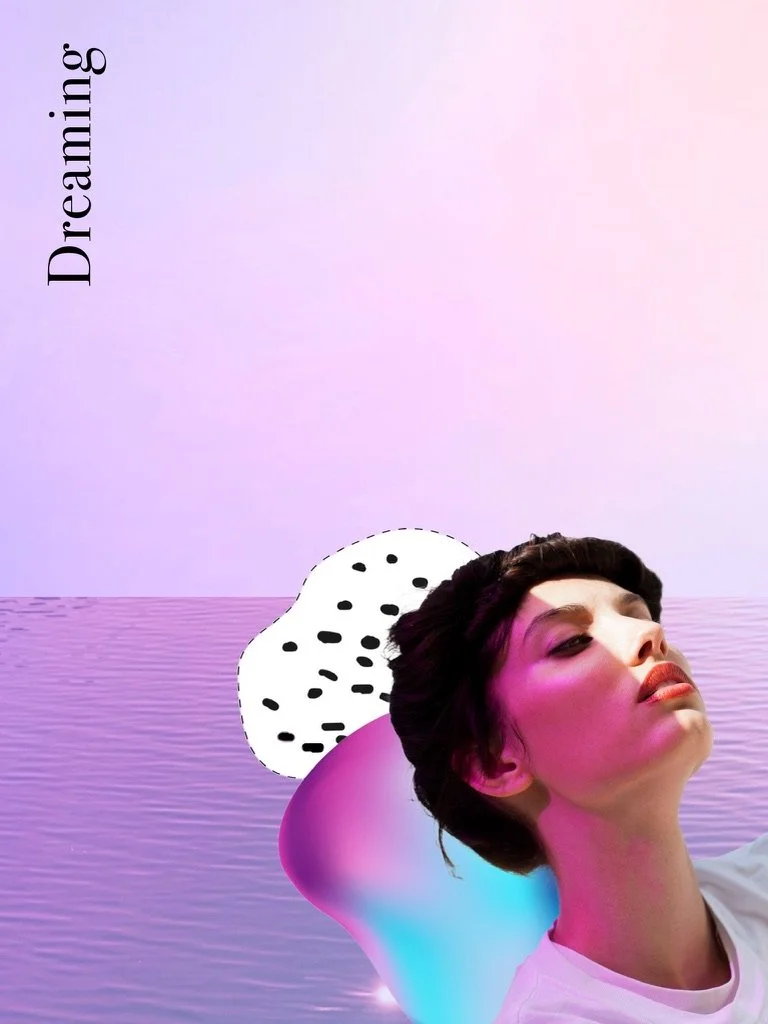
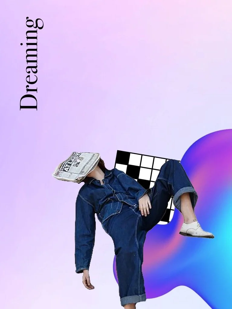
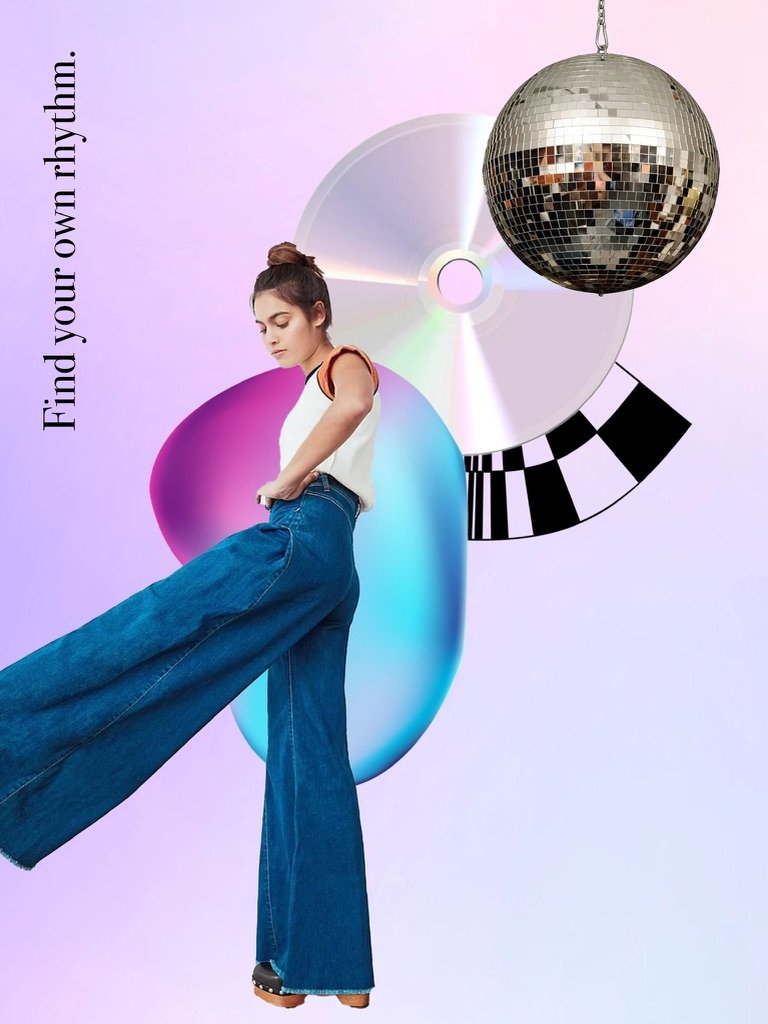
After multiple rounds of refining moodboards, cohesive themes began to emerge:
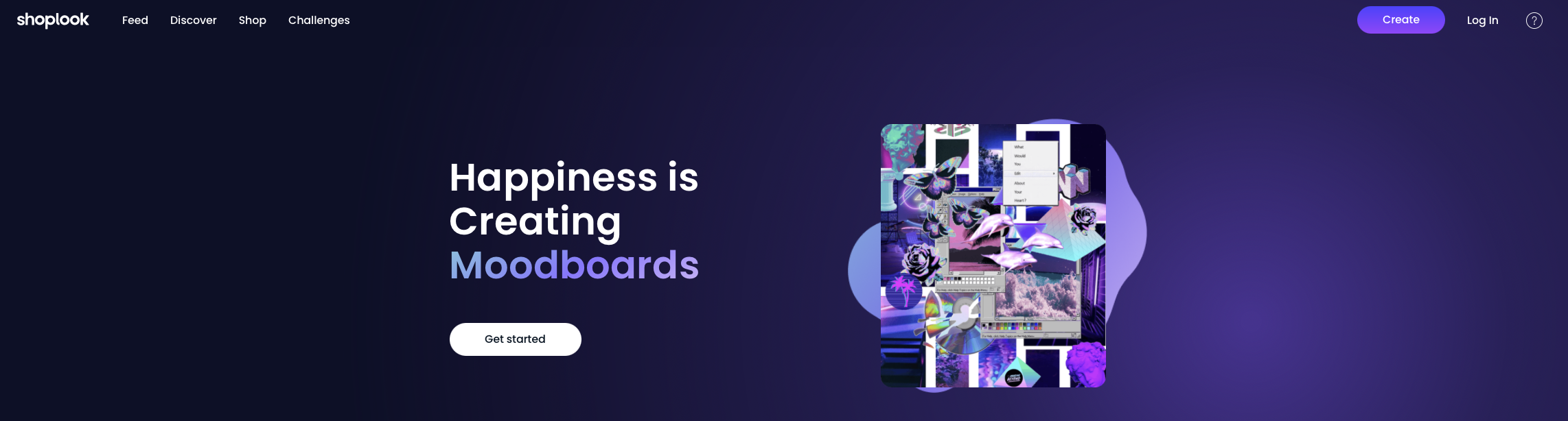
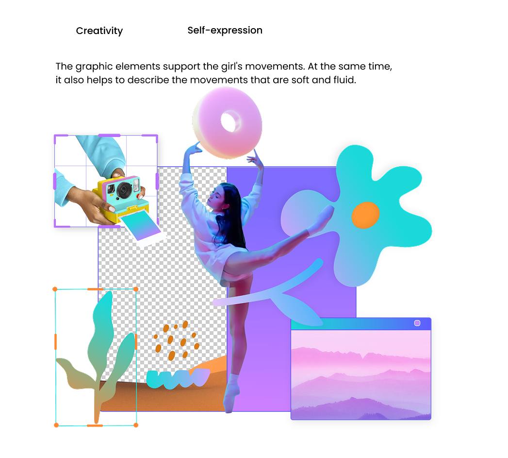
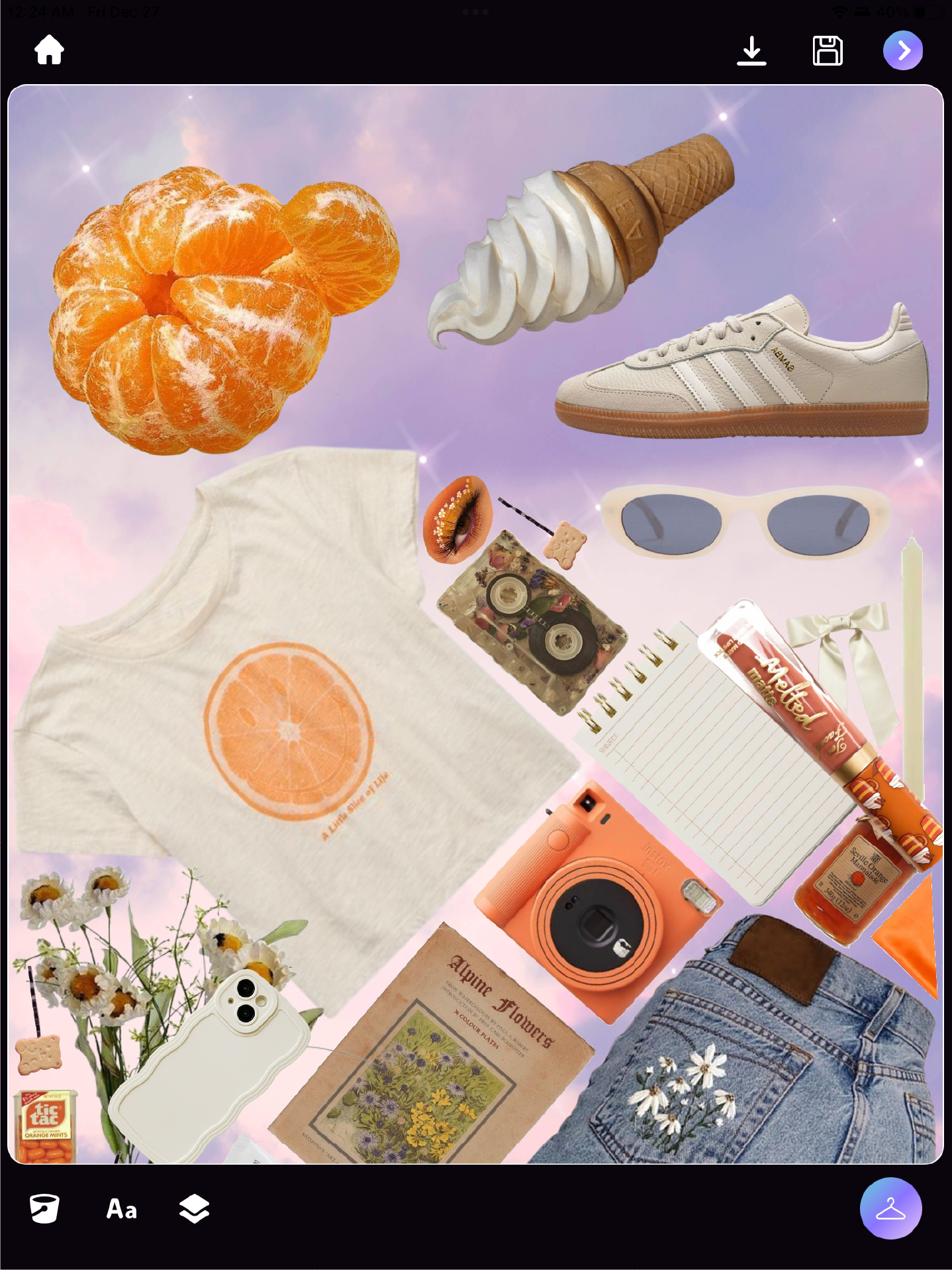
Focus: Visual aesthetic reflecting the creativity and self-expression of our users.
Canvas: Overlapping, collage-like layouts
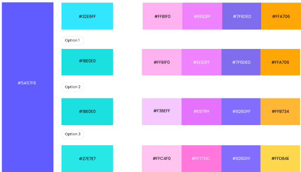
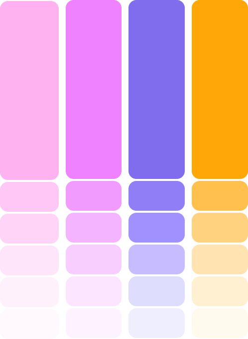
Color: Bright violet color palette and gradients
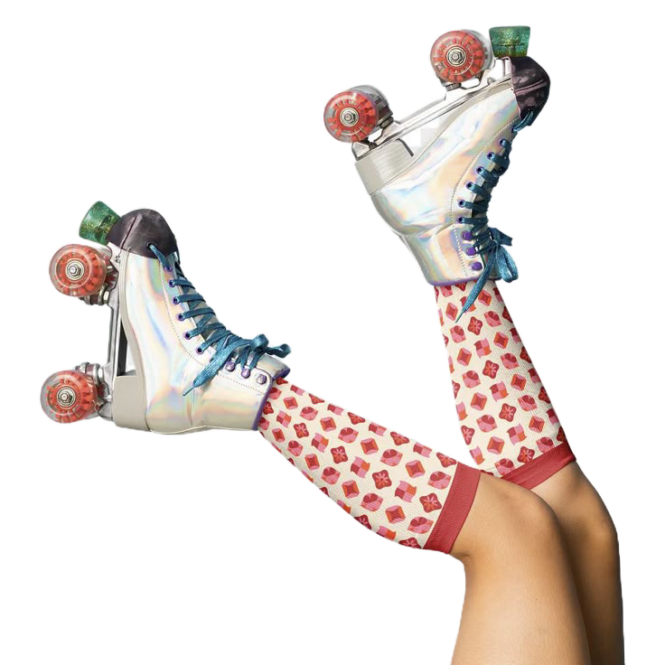
Sharp image cutouts: Stickers, retro ephemera, photography, textures
3D imagery: Playful objects, abstract shapes
Illustration: Text, doodling
3



Agency Management & Collaboration
My Role:
External agency collaboration, guidance, and project management through cycle of reviews and iterations as the brand book and guidelines were built and refined.
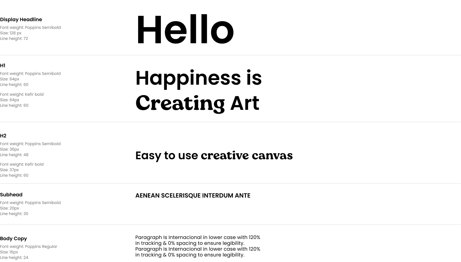
Translation of moodboards into foundational brand elements: brand value, typography, color palette, and UI elements.
1

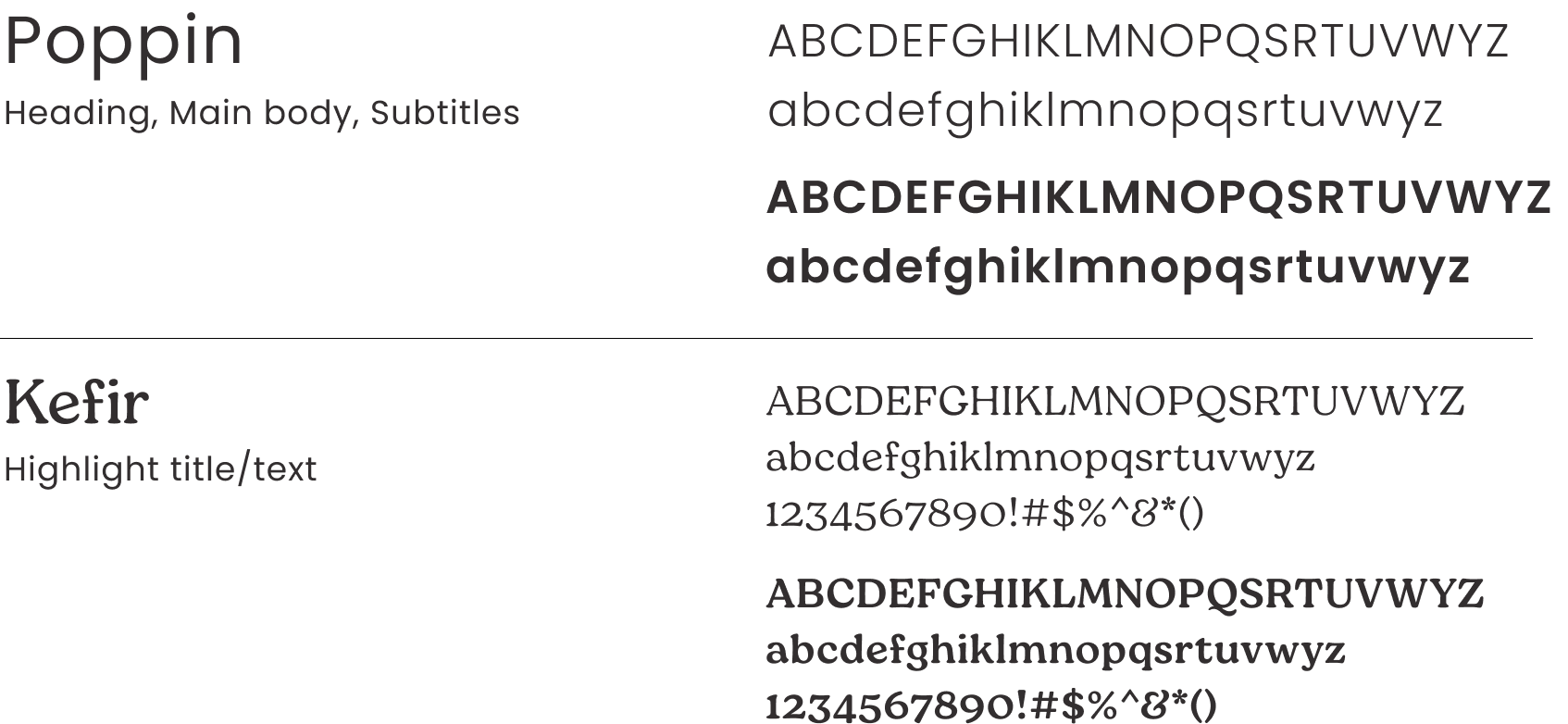
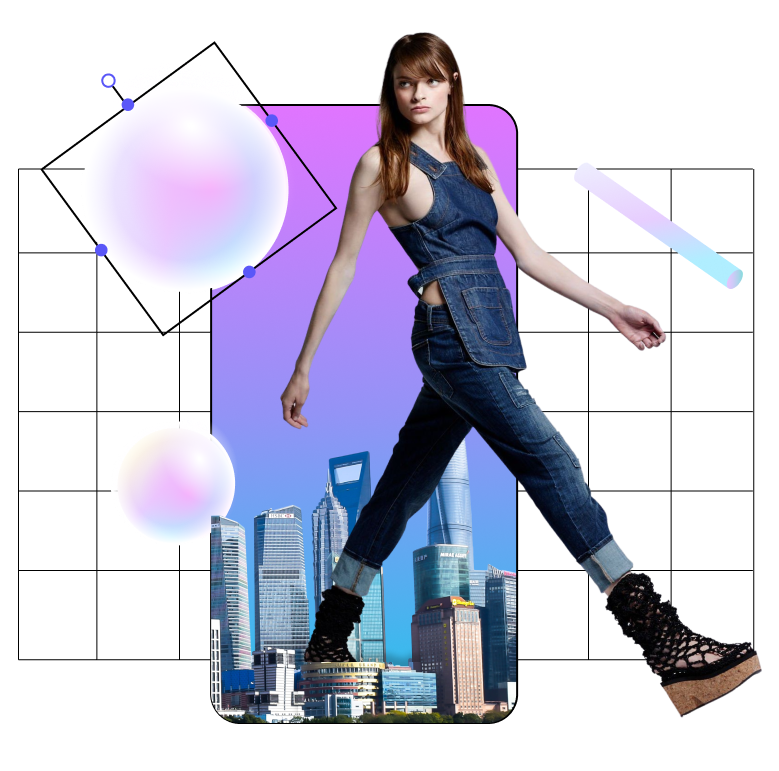
Move beyond key elements of the aesthetic into refinement of color palettes, fonts, typography, and key UX visuals.
2



Final Assets and Guidelines
My Role:
Finalized asset library and guidelines delivery.
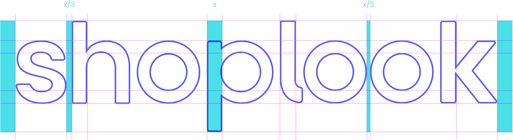
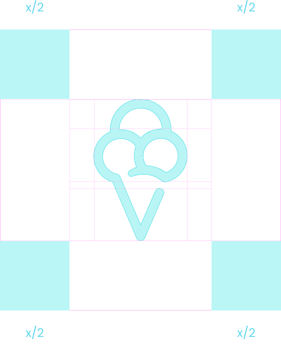
Usage guidelines for fonts, icon and wordmark.
1


2
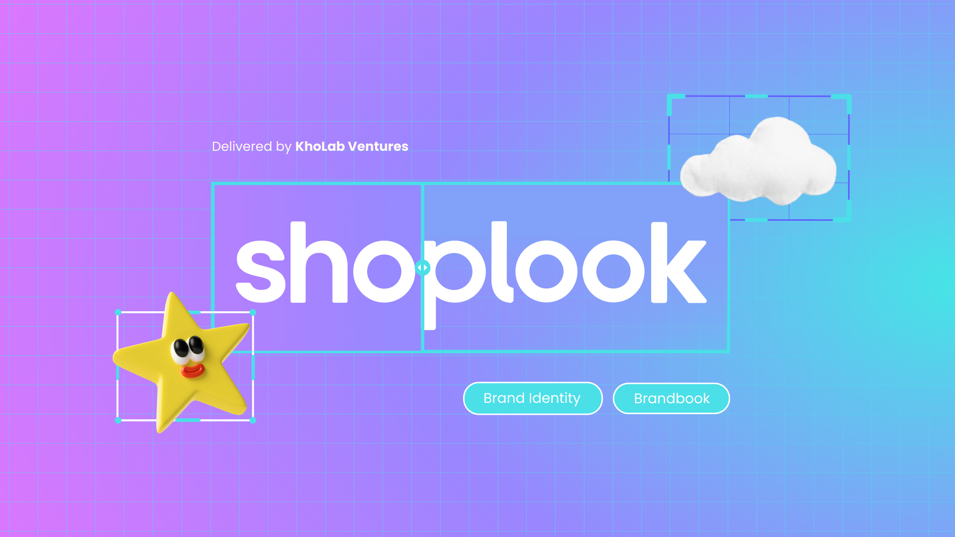
Custom gradient, icons, color, logo, and wordmark.


Rollout, Marketing, and Organic Content Strategy
My Role:
Rollout support and organic content strategy.
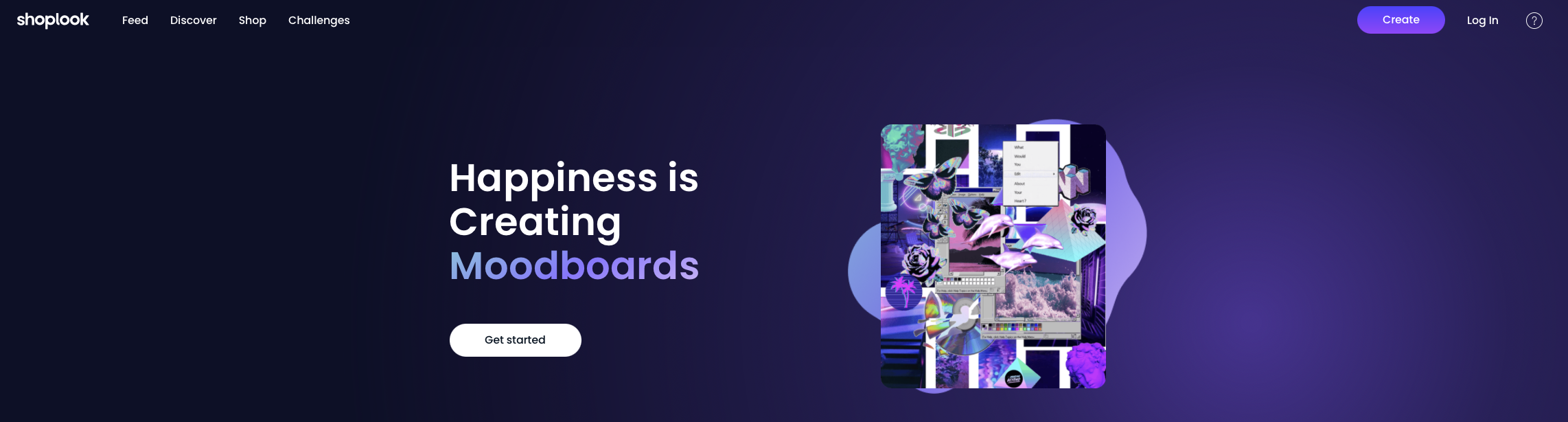
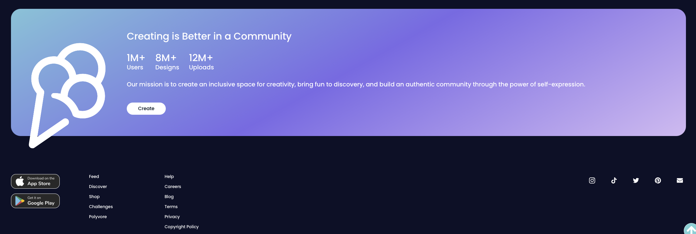
Assets are handed off for implementation across website and app.
1

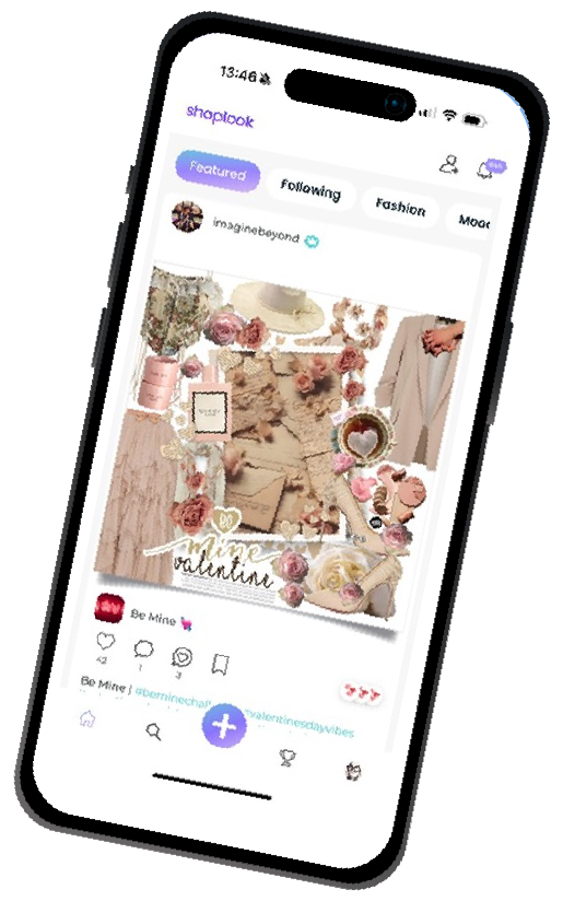
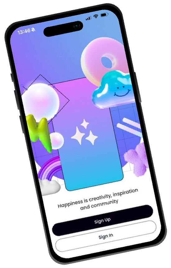

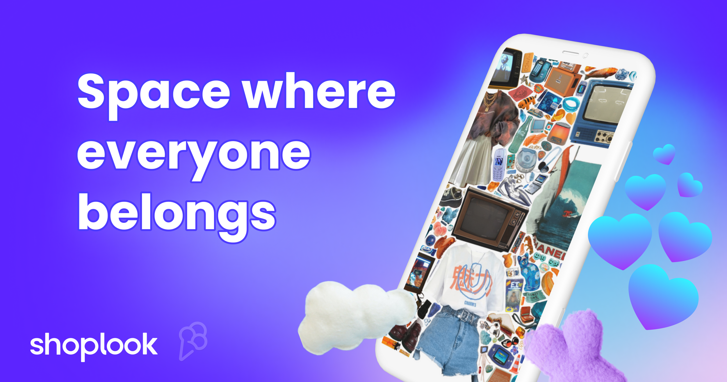
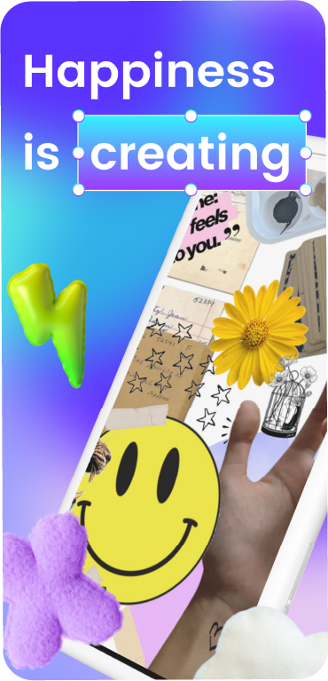
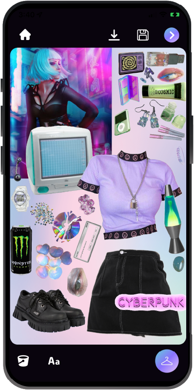
New app store marketing images implemented.
2

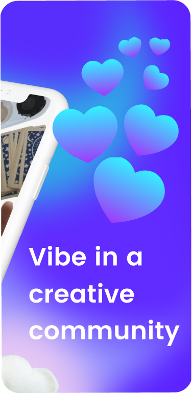
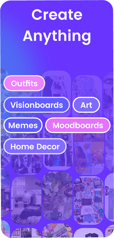
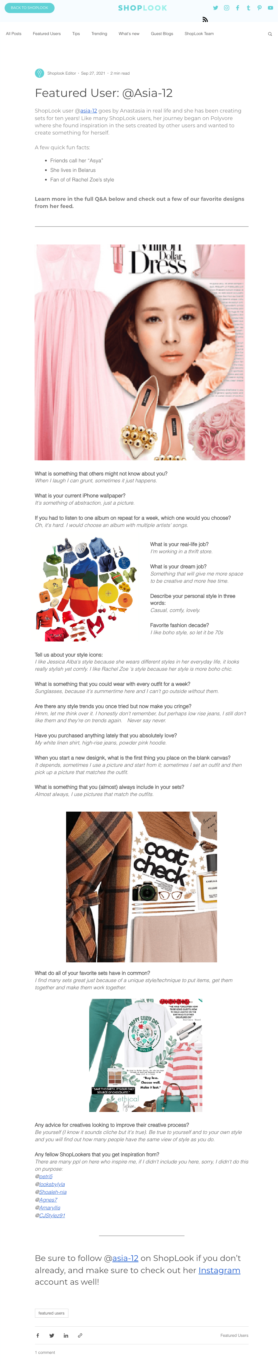
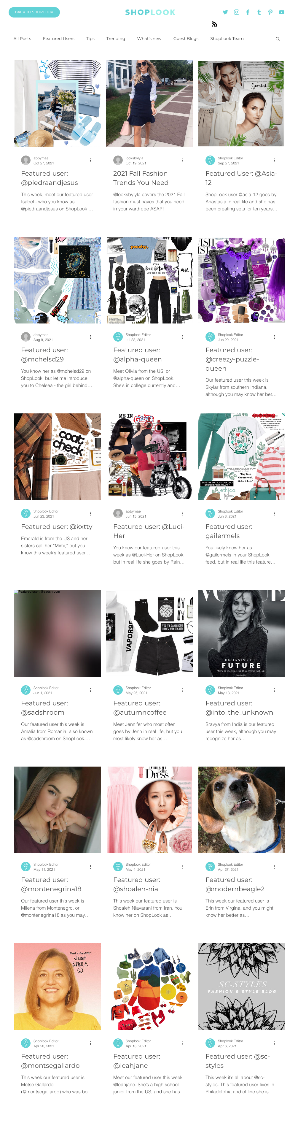
Blog site created with a featured user interview series (written by me) to promote user community interaction and adoption of new brand.
3